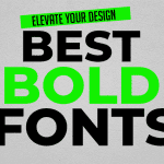
Aesthetic fonts, with their unique shapes, playful details, and distinctive styles, are more than just pretty faces on the page. They’re designer tools that grab attention, evoke emotions (think sleek, modern fonts for tech companies or nostalgic scripts for charming bakeries), and even help establish brand identity (think bold fonts for sports teams or elegant ones for luxury brands). So next time you admire a beautiful design, remember, the fonts might be the secret sauce that elevates it from ordinary to extraordinary.
License
Free for personal use only
Aesthetic Fonts
Ditch the dictionary definition! Typography isn’t just about lining up letters; it’s the invisible orchestra conductor, leading the eye across a page and harmonizing with the design’s message. Imagine text not just being read, but felt. Playful scripts can inject whimsy, while bold serifs command authority. This article dives into the world of these expressive fonts, exploring how they can elevate your designs from functional to phenomenal, transforming text into a captivating visual symphony.
Understanding Aesthetic Fonts
Forget the ones that blend in! Aesthetic fonts are the rockstars of typography, strutting their stuff with unique shapes, intricate details, and a bold refusal to be ordinary. From the graceful curves of elegant serifs to the wild flourishes of stylish scripts, they come in all flavors. These fonts aren’t after blending in; they’re designed to grab attention and set the mood, whether it’s playful whimsy or sophisticated elegance.
The Role of Aesthetic Fonts in Design
Enhancing Graphic Appeal
Don’t just make your design readable, make it sing! Aesthetic fonts are the secret weapon of designers, transforming text into attention-grabbing eye candy. Imagine a wedding invitation where the font itself exudes elegance, or a children’s book cover that bursts with playful energy just from the typeface. That’s the power of these fonts: to grab attention and set the mood, transforming text into a visual conversation starter.
Conveying Emotions and Tone
Fonts aren’t just clothes for your words, they’re mood rings! A clean, sans-serif font speaks volumes: “professionalism” and “efficiency,” perfect for a tech company looking to showcase its cutting edge. But switch to a vintage script, and suddenly you’re whispering “nostalgia” and “charm,” ideal for a boutique with a timeless feel. By understanding the emotional language of fonts, designers can craft messages that resonate not just with the mind, but with the heart.
Establishing Brand Identity
Fonts are the silent brand ambassadors, whispering a brand’s personality to the world. Imagine Chanel rocking a neon Comic Sans – disaster! Instead, their sleek, minimalist fonts shout “exclusivity” and “luxury” in every letter. But fonts can be chameleons too. Ben & Jerry’s playful, quirky typefaces scream “fun” and “approachability,” perfectly aligned with their ice cream’s wacky flavors. By choosing fonts that sing the same tune as a brand’s values, designers create a consistent and memorable identity that fosters recognition and loyalty.
Improving Readability and User Experience
Don’t let fancy fonts turn into fancy failures! Aesthetic fonts are like delicious pastries – tempting and beautiful, but useless if you can’t enjoy them. The key is finding the sweet spot between eye-catching looks and readability. Fonts that go overboard with flourishes might look stunning, but they can leave readers squinting and frustrated. The secret sauce? Choosing fonts that elevate your design without sacrificing clarity. This is especially important for digital projects where people skim content quickly. You want your fonts to be like friendly greeters, inviting users in, not like bouncers keeping them out.
Tips for Using Aesthetic Fonts in Design
Understand the Context
Consider the context in which the font will be used. Aesthetic fonts can be incredibly versatile, but not every font will suit every project. A font that looks stunning on a poster might not be appropriate for a corporate report. Assess the purpose of your design, the target audience, and the message you want to convey before selecting a font.
Pair Fonts Thoughtfully
Gone are the days of typographical monotony! Aesthetic fonts can turn your design into a visual fiesta, but going overboard can be a recipe for disaster. Think of fonts like ingredients – some are bold and exciting, others provide a calming base. The key is to create a harmonious dish, not a kitchen explosion. Traditionally, designers use a fancy font for headlines and a clean, readable one for body text. It’s like having a flamboyant chef announce the specials, then a friendly waiter explain the menu. But fear not, there’s no need to go it alone! Font pairing guides and websites are like cookbooks, offering pre-tested recipes to ensure your typographic creations are both delicious and delightful.
Maintain Consistency
Constancy is key to creating a cohesive design. Stick to a limited number of fonts (usually no more than three) within a single project. This helps maintain a unified look and feel, making the design more professional and polished. Use consistent font sizes, weights, and styles throughout to ensure a harmonious design.
Experiment with Order
Typography hierarchy is the practice of organizing text to guide the reader’s eye through the content in a specific order. Using aesthetic fonts effectively involves playing with different font sizes, weights, and styles to establish a clear hierarchy. Headlines, subheadings, and body text should be distinct but complementary, helping the viewer pilot the design effortlessly.
Check Across Mediums
Designs are often viewed on various devices and mediums. Aesthetic fonts that look great on a computer screen might not translate well to print or mobile diplomacies. Always test your policies across different mediums to ensure that the fonts continue their appeal and readability regardless of where they are viewed.
Conclusion
Fonts? They’re not just window dressing, they’re the secret sauce of design! Aesthetic fonts are like design chameleons, morphing your project in incredible ways. Want to grab attention? A well-chosen font can turn text into a visual feast. Need to evoke emotions? Fonts can whisper “sophistication” or shout “playful fun.” They even help build brand identity – imagine a tech startup rocking a vintage script! But the magic doesn’t stop there. By boosting readability, aesthetic fonts ensure your message lands loud and clear. Mastering these design superheroes, whether you’re a seasoned pro or a curious newbie, can transform your projects from ordinary to extraordinary. So, unleash the power of aesthetic fonts and watch your creations take flight!


