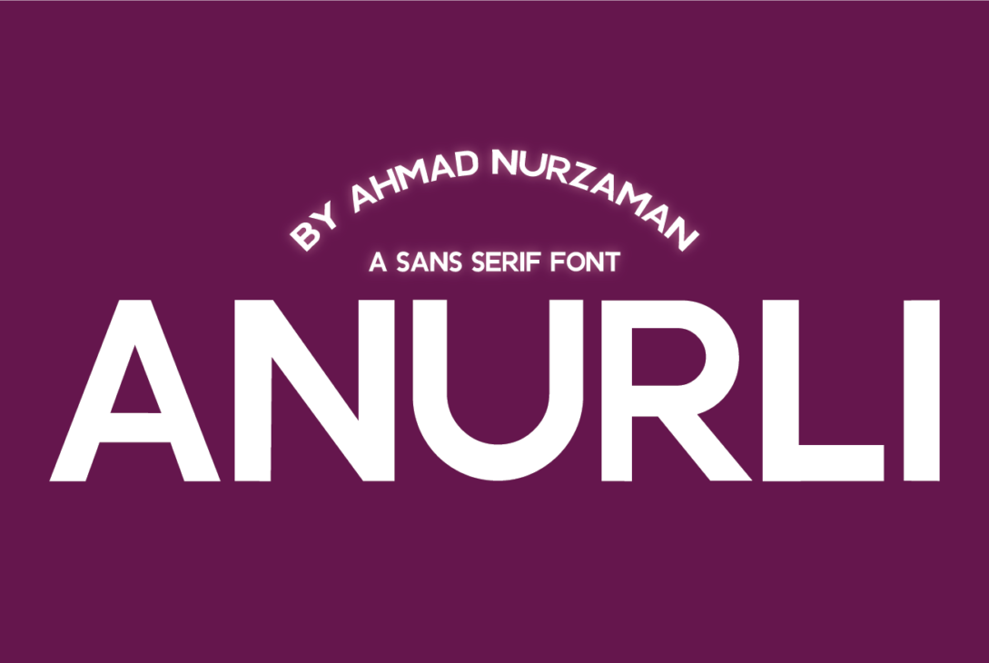
In the world of fonts, where style and readability can sometimes clash, Anurli stands out. Anurli’s special design makes it easily readable font as well as stylish font, which means it works well for many different design projects.
The hallmark of Anurli lies in its easily readable letterforms. The clean lines and balanced proportions ensure that every character is clear and distinct, even at smaller sizes. Whether you’re using it for website titles or long paragraphs in a brochure, Anurli guarantees your message is communicated clearly.
But don’t be fooled by its simplicity! Anurli boasts a subtle and distinctive flair. The flowing curves and sharp angles create a harmonious rhythm that adds a touch of personality to your written content. This touch of elegance elevates Anurli beyond basic, easily readable fonts, making it stand out without sacrificing comprehension.
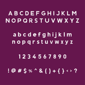
Anurli’s versatility extends beyond its readability. It offers a comprehensive character set, supporting various languages and special characters. Because it works with lots of different languages and symbols, Anurli is a great pick for projects that need to reach people all over the world.
Anurli is like that awesome font that’s both easy to read and looks sharp. It works great for all sorts of things, whether you’re a designer or just want your text to look cool and clear. Anurli even works in different languages, making it super useful! So, if you want your message to be clear and stylish, Anurli is your friend.
Anurli is a sans serif font, meaning it has a clean and modern look without the small decorative lines (serifs) at the ends of the letters. This makes it easy to read, especially at larger sizes or on screens.
Anurli Font Character Set
License
Free for Personal and Commercial Use
Why to Use Easily Readable Font
Here’s the information on why to use easily readable fonts rewritten in simpler words:
- Easy to Read, Easy to Understand: People should understand your message right away, especially if they’re reading it online.
- Happy Users, Happy You: No one likes squinting at tiny words! Easy-to-read fonts make using your website, flyer, or anything else you design a breeze. This keeps people happy and coming back for more.
- Works for Everyone: Not everyone has perfect vision, and some people use small screens. Easily Readable fonts help everyone understand what you wrote, making your stuff more inclusive.
- Looks Good Everywhere: These fonts work great on phones, computers, or even in printed things. They keep your design consistent and clear no matter where people see it.
- Looks Pro: Clean and easy-to-read fonts make you look professional and like you know what you’re doing. It shows people you care about them understanding your message.
- Focus on the Message: Easy-to-read fonts don’t try to steal the show. They let your words be the star, which is important for things with a lot of writing.
Bonus reason: Easy-to-read fonts can also make your design look modern and fresh!
Importance of Stylish Font
Fancy fonts can be fun, but they also have a job to do! Here’s why they matter:
- Like magic clothes: A cool font can change how people feel about your message. A playful font makes things seem fun, while an old-fashioned one can feel serious.
- Stand out from the crowd: A unique font can grab attention, like a cool outfit in a room full of jeans.
- Be remembered: A special font can become like your own symbol, helping people remember you.
But remember, even the fanciest clothes need to fit right! If a font is too hard to read, nobody will understand your message. The best fonts are both stylish and easy to read.


