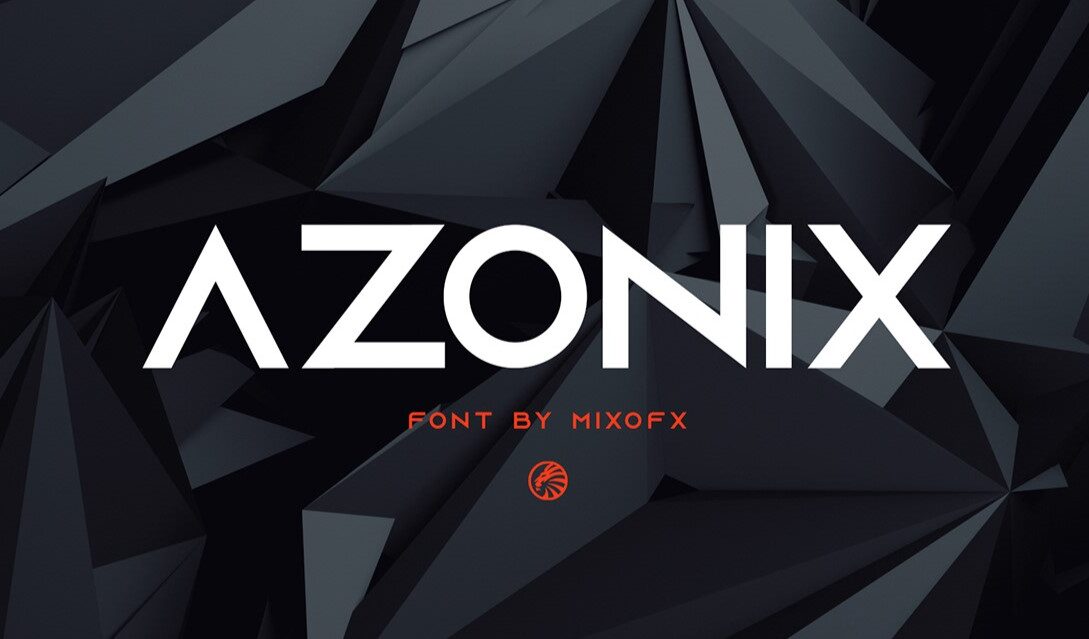
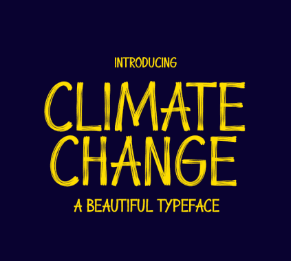
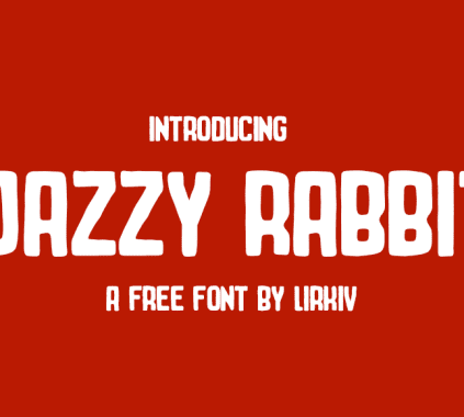
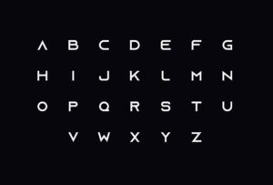
Azonix isn’t your average modern sans serif font. Sure, it’s clean and easy to read like other modern fonts, but it’s also got a bold, geometric twist! Think sharp corners and cool shapes that make your text stand out.
Here’s why Azonix rocks:
- Headlines that Pop: Grab everyone’s attention with Azonix’s bold style in your titles.
- Logos People Remember: Design logos that are modern and leave a strong impression.
- Websites that Shine: Make your website look sharp with a cool, modern font.
- Eye-catching Marketing Materials: Flyers, posters, social media – Azonix will make your stuff stand out.
Even though the uppercase letters are the stars of the show, Azonix has all the regular letters, numbers, and symbols you need. This means you can use it for short text too, not just headlines.
So, if you’re looking for a modern font with a little extra something, Azonix is your pick! It’s the perfect way to add personality and punch to your designs.
Character Set of a Modern Sans Serif Font Azonix
License
Free For Personal Use
Why Sans Serif Fonts are important?
Here’s why sans serif fonts are so important:
- Easy to Read: No fancy tails or swirls here! Modern sans serif fonts are clean and clear, especially on small screens like phones. This makes them perfect for big chunks of text you want people to understand easily.
- Modern and Sleek: They have a simple, modern look that makes your design feel fresh and up-to-date.
- Super Versatile: Sans serif fonts work almost anywhere! Websites, apps, logos, flyers – you name it!
- Helps People Use Stuff Easily: Clear fonts make websites and apps easier to navigate. No one likes squinting to find what they need!
- Can Show Feeling Too: Even though they’re simple, sans serif fonts can still give your design a certain vibe. A thin font might feel elegant, while a bold one can feel strong and stable.
Here’s where sans serif fonts shine:
- Websites & Apps: People can find what they need quickly with clear menus and buttons.
- Logos: Create a modern and professional logo that looks sharp.
- Flyers & Posters: Get your message across easily with fonts that are readable at a glance.
- Books & Magazines: They’re often used for the main text because they’re easy on the eyes.
But remember, sans serif fonts aren’t always the answer. If you need something super fancy or traditional, a different font might be better.
Sans serif fonts are awesome for clean, modern designs that are easy to read and use.
Importance of Modern Fonts
In a world where things change fast, modern sans serif fonts gotta keep up too! Modern fonts are like the stylish clothes of the design world, making your projects feel fresh and exciting. Here’s why they rule:
- Grab Attention: A modern sans serif font is like a neon sign for your design, saying “Hey! Look at this cool, up-to-date stuff!”
- Connect with People: Modern fonts are like secret handshakes with your audience. They show you understand what’s popular and what they like.
- Stand Out From the Crowd: Tired of boring designs? A modern font adds personality and makes your project unique and memorable.
- Feeling the Feels: Modern sans serif fonts can even make people feel certain ways. A clean font might feel fancy, while a fun one might feel playful.
- Works Everywhere: Modern sans serif fonts are like chameleons – they can look good on websites, apps, posters, or anywhere you need them!
But it’s not all about looks! Here are some other things to think about:
- Easy to Read: The coolest font ever is useless if no one can understand it! Make sure it’s clear and readable.
- Who You’re Talking To: A font for teenagers might not work for your grandma. Pick a font that your audience will like.
- Matches Your Design: Imagine a super modern font on an old-fashioned poster – yikes! Make sure the font fits the overall vibe of your project.
Modern doesn’t mean something crazy that will be out of style next week. Pick a font that looks fresh now, but also has staying power to keep your design looking sharp.


