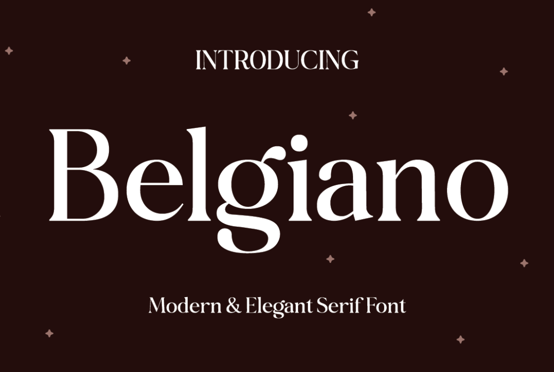
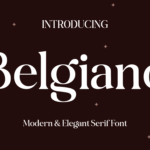
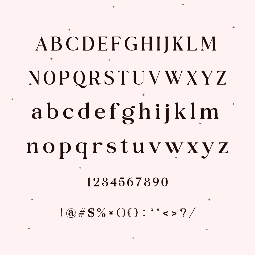
Belgiano serif font is a modern and elegant writing style that looks classic and fancy. It’s like the letters you might see in old-fashioned books but with a touch of modern flair. The lines of this serif font are smooth, and the edges have small decorations that make it look elegant. When you read something written in Belgiano Serif, it feels like stepping into a sophisticated world where every word is carefully chosen.
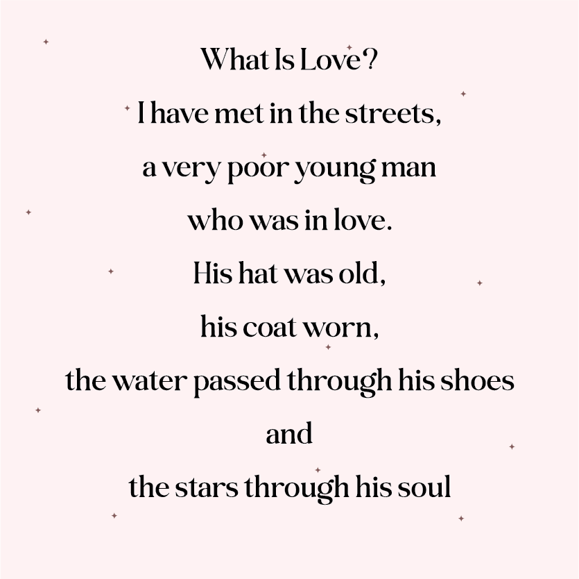
Belgiano Sample:
Letters and symbols of Belgiano:
License
Free for personal and commercial use.
What is a Serif Font?
Fancy fonts with little tails (serifs) on the edges of letters are called serif fonts. These fonts are, like Times New Roman, Georgia, and Garamond. They make things look old-fashioned and important, so they’re used in books, newspapers, and fancy documents.
One good thing about these fonts is that they’re easy to read, especially in long paragraphs. The little tails help your eyes move along the lines smoothly. This is important for things like books where you’re reading for a long time. The letters are also thicker and thinner in different spots, which makes them easier to tell apart.
These fonts have been around for ages, back in time when ancient Rome carved letters into stone. Over time, these fonts changed styles throughout history, like during the Renaissance and the Baroque period. Today, there are many kinds of serif fonts, from old-fashioned to modern and sleek, so designers can choose the one they like best for their project.
As we mentioned earlier these fonts are easy to read on paper, they’re also used on computers and phones. Even though most websites use plain fonts without tails (sans-serif fonts) because they look more modern and simple, serif fonts are still used to make things look more important or official. They can also be used with plain fonts to make things look more interesting.
The font you choose can really change how people percieve your writing. For example, a font with sharp tails might look more modern and fancy, while a font with round tails might look more old-fashioned and friendly. Designers pick fonts carefully to make sure their message comes across the way they want it to.
In recent times, designers have gotten excited about serif fonts again. They’re coming up with new ways to use these old styles for modern times. So, these fonts are always changing to keep up with how people like things to look, but they’re still in fashion because they’re easy to read and look nice. It doesn’t matter if you see them on paper or on a screen, serif fonts are a substantial part of how we see texts, and they’re here to stay!


