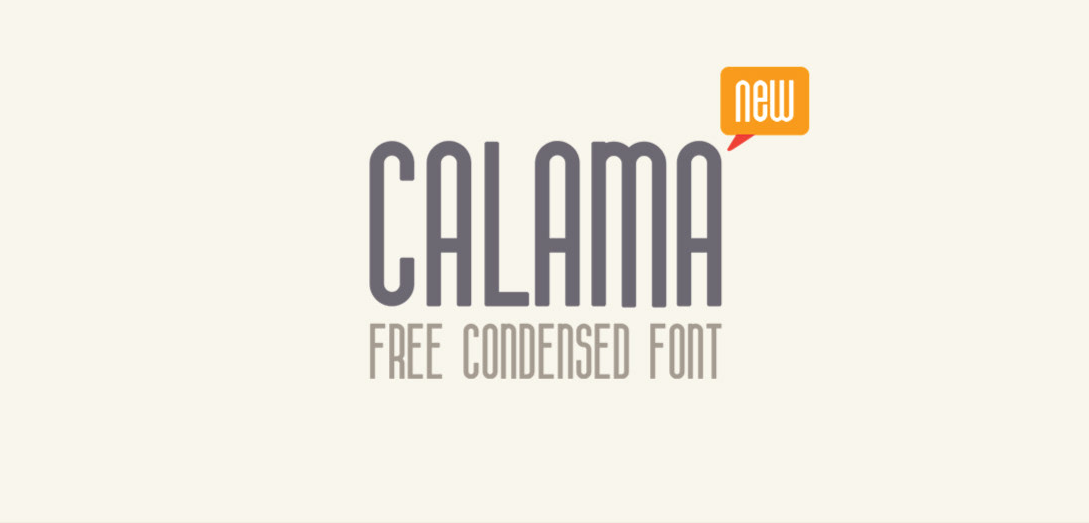
Absolutely! Calama stands out as a condensed fonts geometric sans serif font by Ben Karamyan . Imagine a modern, clean typeface where the letters are a bit squished together for a more compact look. But instead of sharp edges, Calama softens things up with friendly, Condensed Fonts rounded corners. This unique combination makes it a champion for titles, headlines, and grabbing attention on posters or logos. It can pack a punch with fewer letters, leaving a clear and impactful message.
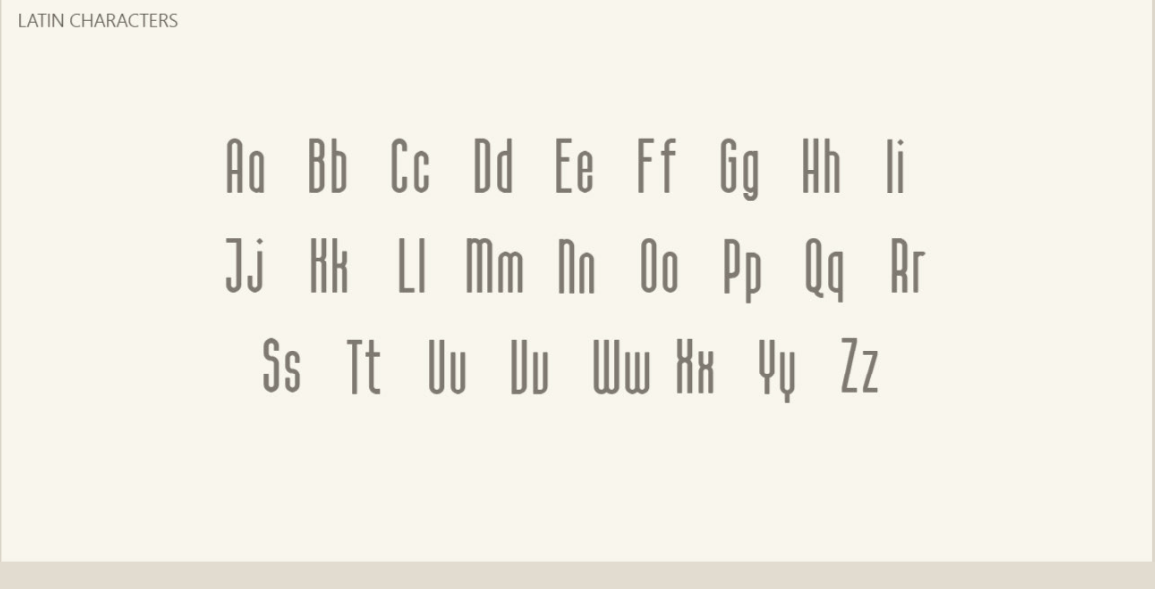
Camala A Free Condensed Fonts Latin Characters
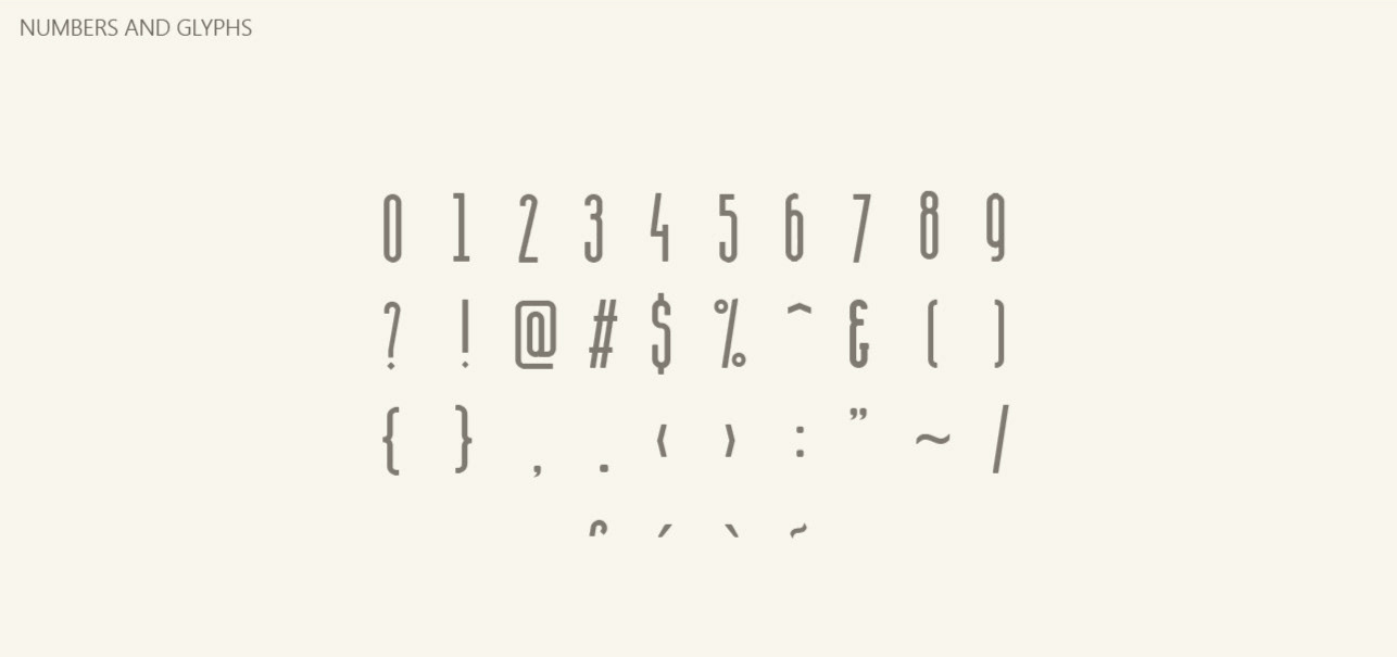
Numbers And Glyphs
License
Free for personal and commercial use.
Condensed Fonts
Condensed fonts are basically tall and skinny versions of regular fonts. Imagine taking a regular typeface and squishing it horizontally to make it narrower. Here’s a breakdown of their key features:
- Narrow width: This is the defining characteristic. Condensed font have characters that are narrower than their regular counterparts from the same typeface family.
- Taller height: To compensate for the squished width, condensed fonts often have taller characters. This maintains the overall proportions of the letters and improves readability.
- Space saving: Due to their narrowness, condensed fonts are great for fitting more text into a limited space. This can be useful for headlines, labels, or fitting a lot of information on a page.
Here are some additional things to know about condensed font:
- Readability: While they can save space, condensed font can be trickier to read, especially at smaller sizes. This is because the narrower letters have less space between them, which can make them appear crowded.
- Design choices: Beyond saving space, condensed font can also be used for their unique aesthetic. They can add a modern, sleek, or even funky feel to a design.
If you’re considering using a condensed font, be sure to weigh the space-saving benefits against the potential readability drawbacks.
Visited 58 times, 1 visit(s) today