Calligraphy is the art done on paper that involves well-scripted writing. It harmonizes beauty and technique in order to produce exquisite letters and patterns. For people who have little or no experience in calligraphy, it is crucial to learn how to use calligraphy pens. In this guide, you are going to discover some necessary steps that will enable you to get started.
1. What is Calligraphy?

Calligraphy is more than just fancy handwriting. It is about creating letters with specific strokes. Here are three important concepts:
- Pressure: The strength of the pressure you apply determines the thickness of the line that you make on the paper. The more pressure is applied, the thicker the line will be, and the less pressure used, the thinner the line will be.
- Angle: These are taken by maintaining the pen’s slightly positioned incline of 30-45 degrees to achieve such a stroke.
- Rhythm: Writing in general, especially calligraphy, should not be jagged or rough. This may lead to the writing being messy, especially if you are writing in letters.
With these basic ideas in mind, you’re ready to learn more about using calligraphy pens.
2. Choosing the Right Calligraphy Pen

There are different types of calligraphy pens, each with unique features. Picking the right one depends on your comfort level and the style you want to practice. Here are the most common types:
- Dip Pens: These are the most traditional calligraphy pens. Before writing, you have to dip them into an ink well. Dip pens enable you to achieve thick strokes or thin strokes depending on how you hold them, but you need to do it severally.
- Fountain Pens: These pens have an ink reservoir inside, so there’s no need to dip them. It stays for a longer period and is simple to use.
- Brush Pens: These are perfect for the newish calligraphy style. The tip of the brush is flexible, thus having the ability to produce thin or thick lines without straining. Brush pens are beginner-friendly.
- Marker Pens: These pens come in two types: chisel or bullet, so these pens are well suitable for bold lines. Some are easy to use and best for practice situations.
It’s best to start with a pen that feels comfortable. You can always try different types as you improve your skills.
3. Understanding Nibs
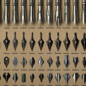
The nib is the metal tip of the pen, and it’s what makes the strokes. Nibs come in different shapes and sizes:
- Broad-Edge Nibs: These are flat and useful in drawing thick and thin lines depending on the angle of the pen placed. They are best for the new age calligraphy styles, including the Italic or Gothic typefaces.
- Pointed Nibs: These nibs are sharp and flexible and produce thin lines while drawing. They are mostly preferred when it comes to more aesthetic scripts, such as Copperplate.
- Brush Nibs: These are versatile and enable the artist to produce strokes of different thickness, depending on the amount of pressure applied.
For beginners, it’s best to start with a medium-sized nib. This gives you control and helps you learn the basic strokes.
4. Mastering Basic Strokes
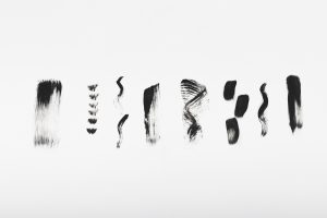
Calligraphy is built from simple strokes. Practicing these basic strokes will help you form clean and beautiful letters. Here are the main strokes you’ll need:
- Upstrokes: These are light and thin lines. If you lift the pen higher, apply less pressure to it when you are drawing or writing.
- Downstrokes: These are heavier, thicker lines. Use the pressure as follows: when drawing a line downwards on the paper or parchment, increase the pressure.
- Oval Strokes: The letters such as “a” and “o” are made with oval or semi-oval figures. These exercises, which include practicing ovals, will enhance control.
- Curved Strokes: Such letters as “u” and “n,” for example, are drawn by various smooth curves.
Practice these strokes regularly. Over time, your hand will get used to the movement, and your calligraphy will improve.
5. Choosing the Right Paper
The type of paper you use affects how your pen and ink work. Not all paper is good for calligraphy, so it’s important to choose the right one. Here’s what to consider:
- Smooth Surface: When choosing paper, therefore, look for paper that has a smooth surface. This will also be of considerable importance in preventing your pen from dragging on the paper in certain places while making rough draws.
- Absorbency: Paper that has ink bleed or smudging is normally as a result of taking in too much ink. What you desire is a paper that does not soak ink while at the same time ensuring that it does not release ink when need be.
- Thickness: Preferably, the paper should be thicker, or at least 80 gsm and above. Thin papers may have some transfer of ink on the other side of the paper, and this may spoil your work.
There are special calligraphy pads available, but good-quality printer paper or marker paper can work well for practice too.
6. Proper Positioning and Posture
How you sit and hold the pen is important for good calligraphy. It helps you stay comfortable and write better. Here are some tips:
- Sit up straight with your feet firmly placed on the ground. It also helps to keep your body in the right posture, which is important in testing.
- Turn the paper slightly to the left if you are right-handed; if you are left-handed, turn the paper slightly to the right. This makes it easy to produce smooth strokes.
- A pen should be gripped with fingers and thumbs in such a way that the pressure applied by them should be moderate. It may also be slippery; therefore, do not hold it too tightly.
Good posture will help you stay focused and avoid hand strain, especially during longer practice sessions.
7. Practicing Different Calligraphy Styles
There are many calligraphy styles you can try. Here are some popular ones:
- Italic Calligraphy: This style in particular has inclined, flowing letters. It is one of the simplest dances to master.
- Gothic (Blackletter): Gothic lettering is sharp, and its calligraphy is very contrasted and strict. It is also documented to have been used on most of the manuscripts produced in the medieval period.
- Copperplate Calligraphy: This style of writing is characterized with elaborated letters of thin necks and thick strokes as they descend downwards. It is usually applied where an invitation is being extended and in designs.
- Modern Calligraphy: This kind of style is far from traditional and somewhat is more of an art. The best thing is that one can experiment with the letter shapes and make it as unique as possible.
Start with one style that interests you, and once you get the hang of it, explore others.
8. Fixing Common Mistakes
Everyone makes mistakes when learning calligraphy, but that’s okay! Here are a few common issues and how to fix them:
- Uneven Strokes: Eventually, it is necessary to maintain pressure. Holding the pen at the same angle as before and applying the same amount of pressure to the paper.
- Ink Smudges: Be sure the paper is right for your pen and ink. It also calls for breaking some speed as the ink dries.
- Shaky Lines: If you aren’t sure of how to go about it, simply take your time and don’t rush the process. This is a basic rule when it comes to writing: the longer you sit in front of a writing desk, the steadier your hand becomes.
Don’t rush the process. With time, your writing will become smoother and more polished.
9. Enjoy the Process

It can be said that the major disadvantage of calligraphy is that it takes time to learn, but the outcome is really worth it. Do not get upset if the letters that you are sending are not perfect in the first instance. It is beneficial to maintain a practice log so that you are able to see how much you have improved over time!
Conclusion
The use of writings, especially in letters, makes calligraphy a beautiful way of showing artistry in writing. It is always important to note that the use of calligraphy pens is accessible to anyone willing to learn as long as he or she practices enough. Beginners must begin with simple steps and try various techniques because if you do not enjoy what you are doing, then you will not progress. Happy writing!

Learn About Typography/Fonts
For those looking to delve deeper into the arena of typography, right here are a few additional topics to explore:
- The Emotional Effects of Fonts in 2024: How fonts can evoke emotions and affect perceptions.
- The History of Typography: Kerning, tracking, main, and ligatures.
- Web Fonts 101: Optimizing Typography for the Digital World: Print, web, and mobile design.
- Fonts in Branding: How fonts can contribute to brand identity.


