Selection of Right Typeface is Important
Selecting good typefaces is crucial in understanding, reaching, and getting the full attention of the viewers of the intended message. The type of fonts that you choose also has an impact on the emotions that the audience has towards the content and the ability of the passerby to understand your content. Below is a basically directory of how to choose typeface that meets your requirements.
1. Know the Purpose
Start by thinking about what your content is for and where it will be seen. Different projects need different fonts.
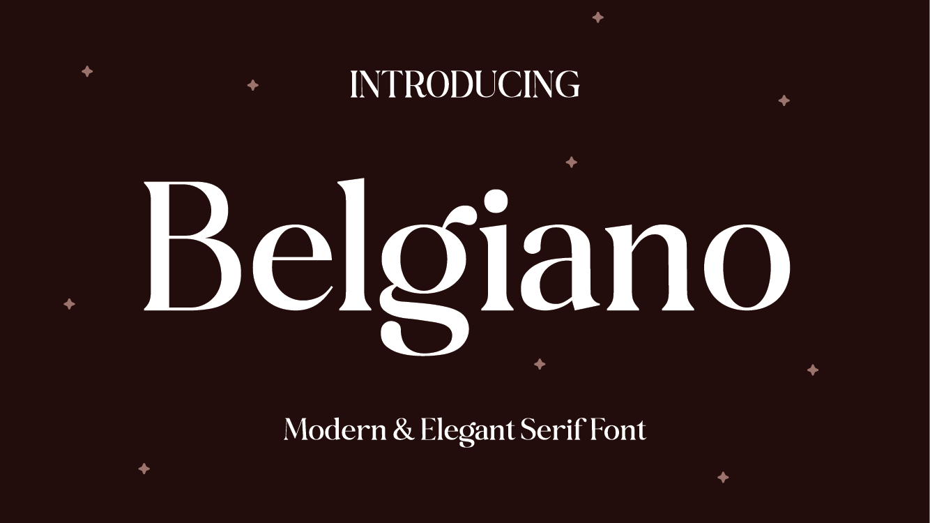
- Formal Documents: Choose the serif fonts such as Times New Roman, Georgia if you are writing a report, research paper, or legal paper. The fonts I have selected are simples fonts where the letters have tiny fine lines at the certain tips to make the fonts look more serious.
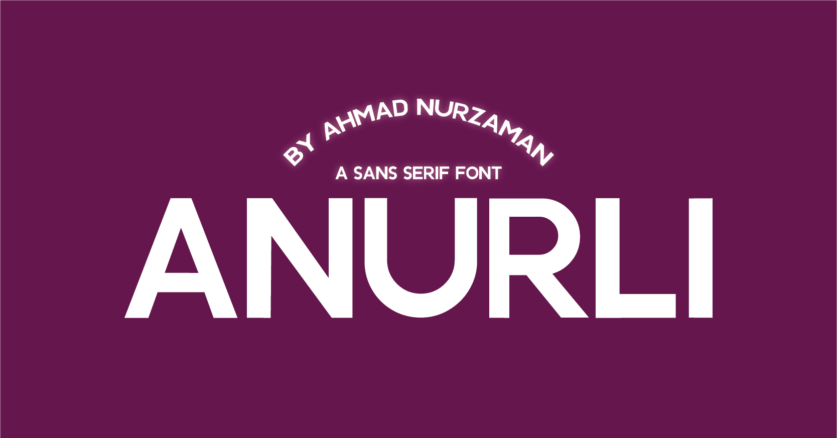
- Digital Content: For websites, apps, or anything on a screen, sans-serif fonts like Arial, Helvetica, or Roboto are better. These fonts don’t have extra lines, so they look clean and modern. They are also easier to read on screens.
- Advertising and Branding: When creating ads or building a brand identity, choose a font that matches the personality of your brand. A playful brand might use a fun, unique font, while a luxury brand might choose something more elegant.

2. Make It Easy to Read
Your typeface should be easy to read in different situations.
- Legibility: Legibility is about how easy it is to tell one letter from another. This is important for things like signs or buttons, where people need to read quickly. Choose a font with simple, clear shapes.
- Readability: Readability is about how easy it is to read longer text. Fonts with good readability have even spacing and clear letters. Serif fonts are often used for printed books because they guide the reader’s eye, while sans-serif fonts are often used for reading on screens.

3. Set the Right Tone
Different fonts create different feelings. Pick a font that matches the tone of your content.
- Serif Fonts: These fonts feel formal and traditional. They are a good choice for serious content.
- Sans-Serif Fonts: These fonts feel modern and clean. They work well for tech, fashion, and simple designs.
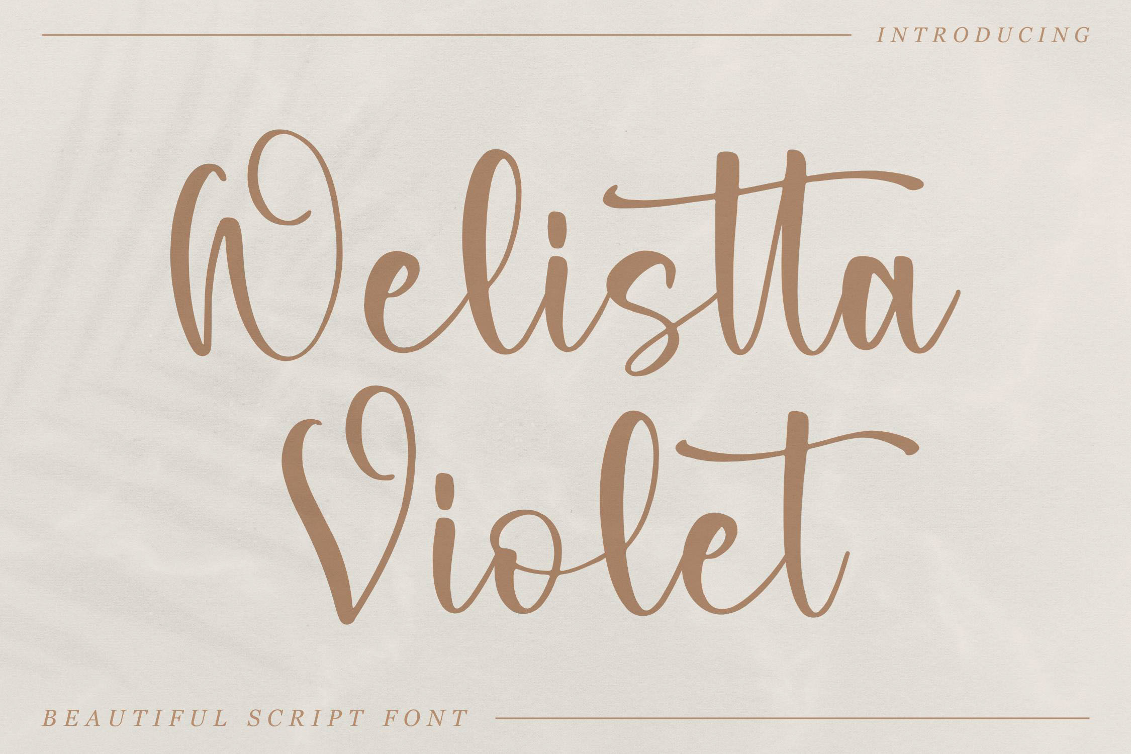
- Script Fonts: These fonts are more of the writing type and are usually decorated, it can be used to give a particular design a touch of elegance or art. But they are hard to read, hence they are appropriate in instances where they are used with short texts for instance titles or invitations.
- Display Fonts: Again, there are little choices of fonts which are however big and immediately captures the attention of the view. They are very appropriate to be used in headlines, posters, logos among others but are not appropriate in long documents as they are not easily legible.

4. Think About Your Audience While Choosing a Typeface
Consider who will be reading your content when choosing a typeface.
- Age: Younger people might prefer modern or playful fonts, while older people might find traditional fonts easier to read.
- Cultural Sensitivity: Different cultures may see fonts differently. If your content is going to be seen by people from the worldwide, it’s better to employ the font free from any political connotations or associations.
- Accessibility: Ensure that your font is one that can be read well by everyone or can in a way be identified easily by people with poor sight. Specifically, it is unbeneficial to use very thin fonts, low contrast and too stylized fonts since they are barely readable.

5. Match Your Brand
Your typeface should depict your brand and model and employed after approval.
- Match Your Brand’s Personality: Select the proper font style that can symbolize your business. A typical example of luxury brand might use an elegant serif fonts while a tech brand might opt for a clean and updated sans-serif font.
- Consistency Across All Formats: Make sure to be consistent with the fonts used in all your printed materials and those on the website and the adverts. This makes others identify your brand, and it looks more professional than seeing a brand with a personal name.
6. Consider Technical Details While Choosing a Typeface
There are also technical things to keep in mind.
- Web Fonts vs. Desktop Fonts: Not all fonts are designed for both print and digital use. Web fonts are made to look good on screens. If your content is online, choose a font that is designed for the web.
- File Size and Performance: Some fonts can be large files, which might slow down your website. If this is a concern, use system fonts (fonts that are already on most devices) or limit how many fonts you use.
- Licensing: Some of the fonts may cost some amount of money especially the business fonts. Just remember that you need to have a license for the font that you have decided to use in your project.
7. Use Pair Fonts Instead of a Single Typeface
You might need to use more than one font in your design. Pairing fonts can add interest and help organize your content.
- Contrast vs. Harmony: When pairing fonts, find a balance. You should also choose a serif and a sans serif font that complement one another, although having a sans serif font and a serif font can give a good contrast.
- Keep It Simple: Ideally, it operates best when no more than two or three fonts are incorporated in to the design. Huge numbers of different fonts make a design look clownish and can be visually confusing to your viewer.
8. Test Your Font Choices
Before you make a final decision, it’s important to test your typeface choice.
- Create Mockups: Make examples of your design using the chosen font. Look at how it appears in different sizes, on different devices, and in various formats. This helps you see if the font works well in all situations.
- Get Feedback: Ask others for their opinion, especially people who are part of your target audience. They might notice things you didn’t, helping you make a better choice.
Conclusion
The selection of the typeface is crucial, as it should provide easy legibility of the text and fit the overall mood of the conversion. With regard to the purpose, readability, audience and its technicality, an individual can choose a font that assist in passing the intended message.