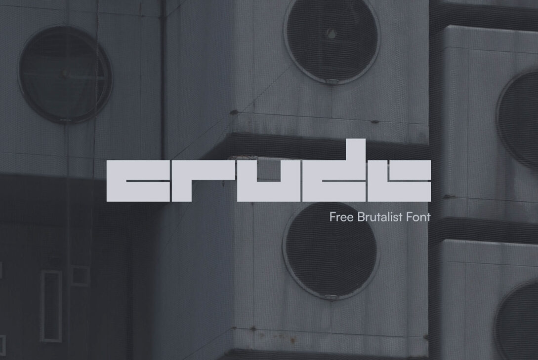
Regular fonts feeling a bit too…well, regular? Spice things up with Crude, a distressed display font that’s anything but boring. Think of it as a cool, grungy upgrade for your text. Like your favorite band tee with a few rips and faded colors, Crude adds instant character and a touch of vintage flair.
Why use Crude?
Stand out: It’s different from other fonts, so your designs will grab attention.
Be bold: It’s a little rough and edgy, perfect for showing off your unique style.
Keep it real: Imperfection can be cool! Crude lets you show your real side.
Who is Crude for?
Designers who are tired of boring fonts.
Anyone who wants their designs to be noticed.
People who like a little bit of roughness and character in their style.
Ready to try Crude?
If you want a font that’s anything but ordinary, Crude is for you! Download it today and see how it makes your designs pop!
Crude Display Image
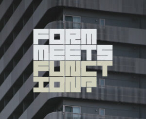
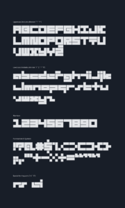
Character Set of Distressed Display Font Crude
Why to choose Crude?
-
Looks Hand-drawn: This distressed display font likely has imperfections that make it look like it was drawn by hand. This adds a personal touch and a sense of fun or informality.
-
Stands Out: Because it’s not a typical font, it can grab attention and make your design more memorable.
-
Matches the Theme: If your project is about something raw, edgy, or handcrafted, this font can visually connect with that idea.
Imagine using this font for a flyer for a punk rock band or a logo for a local bakery. It would fit the vibe, right?
Where to Use?
Here are some examples of where a crude font might be a good choice:
- Flyers for a rock concert
- Logo for a craft brewery
- Packaging for handmade soap
- Children’s book illustrations
Just remember, distressed display font can be hard to read in large blocks of text, so they’re best used for headlines, logos, or short bursts of text.
License
Free for Personal and Commercial Use
Future of Distressed Display Fonts
The future of distressed display fonts is interesting! Here are some possibilities:
-
Continued Popularity: People will likely continue to appreciate the unique look and feel that these fonts offer. They might become even more diverse, with new styles emerging that push the boundaries of what “crude” can mean.
-
Tech Integration: Technology could make it easier to create and use these fonts. Imagine fonts that look like they were drawn with different tools, like charcoal or a rusty pen. We might even see fonts that incorporate a level of randomness, making them even more unique.
-
Niche Uses: Distressed display fonts fonts might become even more specialized for particular design needs. For example, a font designed specifically for horror movie posters could be extra rough and unsettling.
-
Evolving Definitions: As design trends change, the definition of “crude” itself might evolve. What seems rough and edgy today could become more mainstream in the future, with even bolder and more experimental fonts emerging.
Here are some additional factors to consider:
-
Readability Focus: There might be a growing emphasis on balancing the unique look of crude fonts with readability. Fonts could be designed to be slightly less messy while still retaining their character.
-
Accessibility Concerns: With a focus on inclusive design, fonts might be developed that are both visually interesting and accessible to people with visual impairments.
Example of Distressed Font
Rubik Distressed by Hubert and Fischer, Meir Sadan and Cyreal, is an example of distressed display font.
More Fonts to Use as Display Font