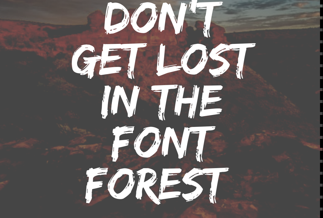
Typography, the art of wielding written language, is a secret weapon waiting to be wielded. It can transform your designs from bland to brilliant, and make your message resonate like a five-star rock concert. Whether you’re a social media swashbuckler or a budding blog bard, this guide will equip you to navigate the typographic terrain with the confidence of a seasoned explorer. Remember, choosing the right font is like picking the perfect armor for your content. A playful script might be perfect for a whimsical party invitation, but a formal report needs a suit of shining professionalism. The key is to match the font to the tone and purpose of your text, ensuring your message cuts through the noise and lands squarely on your target audience.
Unveiling the Magic of Typography
But before we delve into the wardrobe rack of fonts, let’s address a common fashion blunder: confusing typeface and font. Imagine a typeface as a clothing line – it offers a range of styles, like bold or italic. A font, on the other hand, is a specific variation within that line, like a particular shade of blue in a dress collection. Now you’re ready to shop!
Understanding the Lingo: Typeface vs. Font
Our font jungle has two main territories: serif and sans-serif. Serif fonts, adorned with little decorative flourishes at the letter ends, are the classic newspaper and book inhabitants. They act like visual breadcrumbs, guiding the reader’s eye and enhancing readability in large text blocks. Think Times New Roman strolling through a printed novel.
Navigating the Font Jungle: Serif vs. Sans-serif
Sans-serif fonts, on the other hand, are the minimalists of the bunch. Their clean, unadorned lines make them perfect for digital displays and headlines. Imagine Arial rocking a sleek website or Helvetica gracing a bold magazine cover. Their simplicity also makes them readability champions at various sizes.
Readability Reigns Supreme: Choosing the Right Font
Readability reigns supreme in typography. For lengthy passages, fonts like Georgia or Arial are like comfy reading chairs, inviting your audience to settle in and absorb the information. Headings and titles deserve a bit more flair. Here, you can introduce a more stylish or decorative font to grab attention and reflect your personality.
The Power of Hierarchy
Ever felt overwhelmed by a cluttered room? That’s what happens with messy typography. Hierarchy is key to organizing your content and guiding the reader’s journey. Think of it like using furniture to create designated areas in a room. Larger, bolder fonts act as the sofas, highlighting headings. Subheadings might be comfy armchairs, and body text the trusty reading nooks.
Refining Your Design: Kerning, Leading, and Tracking
Now we get down to the nitty-gritty: kerning, leading, and tracking. Don’t worry, these aren’t jungle predators! Kerning is the art of adjusting space between individual characters for a polished look. Leading, or line spacing, controls the space between text lines, making them more breathable and inviting. Tracking, on the other hand, is like setting the spacing between all the furniture in your room. Mastering these elements ensures your text is a haven of visual appeal and readability.
Color: The Unsung Hero of Typography
Color adds another layer of magic to typography. The right hue can elevate readability and weave emotions into your message. Contrast is king – ensure your text color pops against the background. Black on white is a timeless choice, but for digital adventures, dark gray on light can be easier on the eyes.
The Art of Pairing Fonts
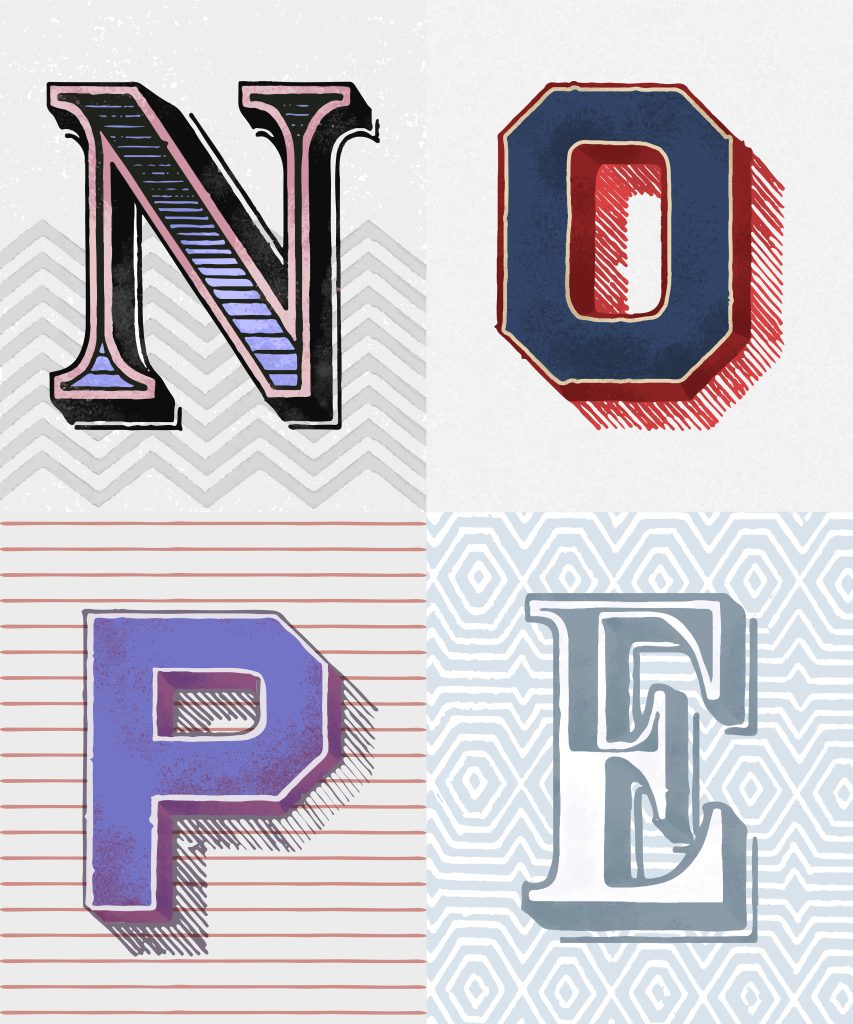
Pairing fonts is an art form, but don’t be intimidated! It’s like creating a harmonious outfit. A serif font heading paired with a sans-serif body text creates a balanced look. Remember, just like you wouldn’t wear five different hats, avoid going overboard with fonts. Two or three is the golden rule for a cohesive and professional look.
Considering the Context: Print vs. Digital
The environment matters too. Print media allows for intricate fonts that take advantage of high resolution. Digital adventures, however, demand clear and legible fonts across various screen sizes. Web fonts, designed specifically for online use, ensure your text looks stunning on any device.
Accessibility in Typography
Finally, let’s champion accessibility for all. Consider users with visual impairments by opting for larger fonts, high contrast colors, and avoiding overly decorative fonts. Many resources are available to make your typography inclusive.
The Art and Science of Typography: A Symphony of Words
Typography is more than just choosing fonts; it’s the silent conductor of meaning, orchestrating the visual impact of your words. Like a skilled musician, the typographer uses letterforms as instruments, their shapes, sizes, and spacing playing a crucial role in how the message resonates with the audience. A serif font, with its elegant flourishes, can evoke a sense of tradition, while a clean sans-serif conveys a modern and minimalist feel. Just as a composer wouldn’t drown out the melody with excessive instruments, a skilled typographer ensures harmony between different fonts, creating a visually engaging composition that enhances the power of the written word. This intricate balance between aesthetics and functionality is what makes typography a true art form and a powerful tool for any communicator.
Conclusion
Ditch the textbook definition – typography is the rockstar of the design world. It’s where science meets swagger, ensuring your message hits the right notes with both readability and visual punch. Picture yourself as a DJ spinning words into a captivating soundscape. Experiment with typefaces, play with hierarchy, and don’t be afraid to throw in a few unexpected remixes (think a quirky font for a playful headline). As you hone your skills and develop a keen eye, you’ll transform from a rookie DJ to a typographic maestro, crafting designs that are both beautiful and impactful. So crank up the creativity and let your inner design guru loose!