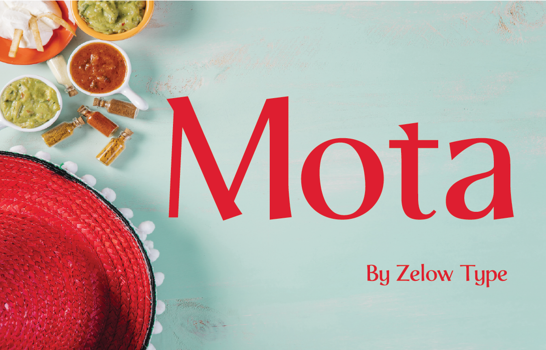
Mota is a unique display font designed by Zelow Type. Mota ain’t fancy, folks. It’s like your favorite pair of worn-in, and ready to get messy. This here font, designed by the good folks at Zelow Type, ain’t got no fancy swirls or pointy bits. It’s clean and simple, a down-to-earth sans-serif that speaks straight to your belly. Forget fancy restaurants with menus longer than your arm, Mota unique display font is the language of backyard barbecues, greasy spoons full of laughter, and handwritten specials scrawled on a dusty chalkboard.
Mota Unique Display Font; A Food Specialist Font

Letters Like Grandma’s Kitchen Knife
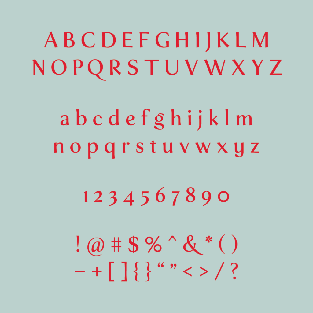
Imagine a font that feels as good on a rusty burger joint sign as it does on a farmer’s market stand. That’s Mota unique display font’s magic, y’see. Its clean lines are sharp enough to get the job done, like a well-worn kitchen knife, but never scary or intimidating. The letters don’t brag or shout, they find a sweet spot, friendly and easy to read. Think of it as the typography version of your grandma’s recipe box, familiar and trusted, like the smell of apple pie wafting from the oven.
But hold on, Mota unique display font ain’t all stiff and proper. The lowercase letters have a playful wiggle, a hint of a smile, like a mischievous wink. It’s like a chef adding a pinch of their secret spice, a touch of personality that makes this font stick in your mind. This subtle quirk keeps things interesting, especially when it’s used for big, bold signs or eye-catching posters. It’s a promise of something delicious to come, like the first bite of a juicy steak.
A Pantry Full of Options
Mota ain’t a one-trick pony. It comes in a variety of weights, like a well-stocked pantry. There’s a light and airy “thin” that’s perfect for delicate pastries, like a ballerina twirling on a plate. And then there’s a bold and hearty “black” ideal for announcing a mouthwatering barbecue special. This versatility lets you tailor the font to the specific dish, I mean, design project, at hand. Need a font as bold as a double cheeseburger? Crafting a menu for a fancy salad bar? The thin weight will have you covered.
Mota unique display font doesn’t need to be the only star on the plate. It pairs beautifully with other fonts, especially those with a handwritten or rustic feel. Imagine Mota as the main course on a plate, the big, juicy steak. Other fonts can be the sides, complementing it and adding extra flavor to the overall design, like mashed potatoes and gravy.
Beyond the Plate and Apron
While Mota unique display font might be the king of food fonts, its uses go way past menus and bakery signs. Its friendly vibe makes it perfect for packaging design, especially for products that evoke a sense of comfort and homeyness. Think of a jar of honey with Mota on its label, or a local cider company showcasing the font on its bottles. Imagine it on a cozy quilt or a mug of steaming hot cocoa.
Mota unique display font is more than just letters; it’s a feeling you can taste. It brings back memories of sticky fingers from childhood birthday cakes, smoky BBQs with friends under a starry sky, and the comforting aroma of a pot roast simmering on the stove. It’s a font that speaks to the soul, reminding us of the simple pleasures that come with food, family, and good company.
Mota ain’t just a typeface; it’s an invitation to a sensory experience. So, the next time you’re designin’ somethin’ that needs a touch of down-home charm, look no further than Mota. It’s the font that will have your audience hungry for more, not just for the information on the page, but for the deliciousness it promises.
License
100% free for personal and commercial use.


