Have you ever watched an advertisement, clicked on a new webpage, or picked up a book? You hardly look at the fonts and typefaces used. Here is what you might not know: fonts are sneaking into your feelings, your memory, and even how much you are willing to believe the information presented to you. They are the unobtrusive substratum of design that, nonetheless, influences your perception profoundly and, in some instances, unconsciously.
What are Fonts and Typefaces?
First of all, it is necessary to define what should be considered the fundamentals of the concept. A typeface is a collection of fonts that are similar in some way and can be used in a singular design project. For instance, Arial is a typeface, and within the typeface you have other font styles such as Arial Bold, Arial Italic, and Arial Regular. Well, to be more precise, let me explain this: Let’s consider the typeface to be a large family and the font as one variant of that family.
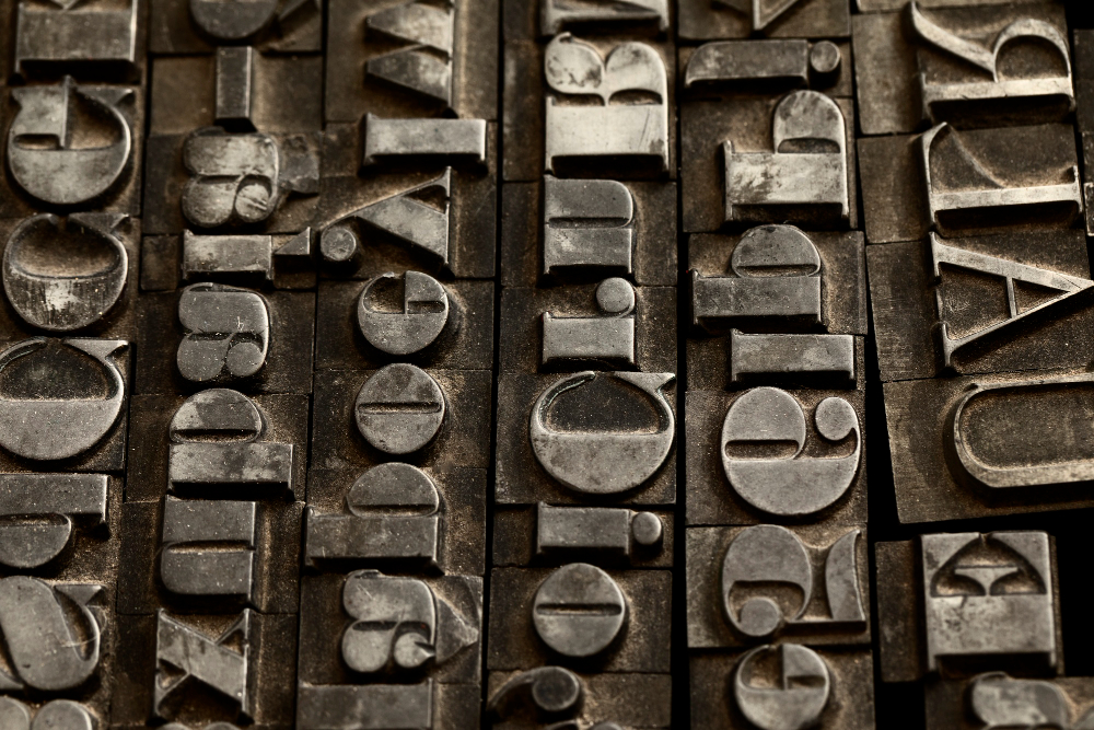
The history of typeface design goes as far back as the history of print itself. Although the innovation of the movable type is attributed to Johannes Gutenberg in the 15th century, the impact of his innovation was the transformation of the world through easy access to written material. As printing expanded, so did the variety of type styles. Since then, typography has come a long way, and today it is an indispensable part of both print and web design.

The Psychological Impact of Fonts
Surprisingly, even the font used has the ability to load a lot of emotions and associations into your head. For instance, where the serif is an obvious variant, such as Times New Roman, it has traditional or formal connotations. Such fonts, with the little strokes at the end of each letter, are mostly associated with articles, or even academic papers, and newspapers. They also provide information with a more classic look, which makes them look reliable and authoritative.
The serif fonts, for instance, may include Times New Roman or Georgia, while the sans-serif fonts’ may include Arial or Helvetica. But when the strokes at the ends of letters are absent, sans-serif fonts are typically considered functional to the core. They are often applied to tech companies’ logos, websites, and applications because they reference simplicity’ and ‘innovation’.
Handwritten styles, at the same time, look more personal and can be elegant, so they are often used for invitations, for instance, for the wedding, or for brands that are related to luxury. However, if used excessively or inappropriately, script fonts may actually serve to impair legibility, so they are employed sparingly.
Another fun part of font psychology is the knowledge that fonts are capable of affecting the perception of information. In a study conducted in the field of psychological science, it was established that people have a tendency to believe information presented in simple fonts. On the other hand, if it is done with a difficult font, people may think it is a tough job or that the information they read is less accurate.

Fonts in Branding and Identity
In branding, fonts are very vital components. It is not just that when a company decides on a font, it selects the one that looks best, but one that conveys the right message. The kind of typeface a brand adopts becomes part of its communication toolkit, like its logos, colors, and images.
Let me take Coca-Cola and Pepsi, for instance. The Coca-Cola Company tagline employs a graphically modified form of a script called Spencerian script, which derives its origin from the handwriting style used in the nineteenth century. This typeface has a historical and culturally rich appeal, an aspect that preserves the brand’s history, culture, and values. On the other hand, Pepsi uses a typeface that is modern and fresh to enhance its erectile implications, suggesting that it continues to grow and transform with time. The fonts assist in shaping the perceptions that consumers have about each brand.
Another recent example is Google, which altered its logo font in 2015. The tech giant replaced its previous serif type with a new sans-serif type font identified as Product Sans. It was done to make Google’s logo appear more fresh and friendly, thus aligning with the company’s shift to a user-centered and mobile-oriented approach. The new font has been adopted from Google’s directions, where it seeks to become simple and useful.
Of all things, fonts can now rise to the level of becoming a brand. Take, for example, Helvetica, which is among the world’s most popular typefaces. Because of its regular and non-descript appearance, Helvetica has been chosen by many, many companies, including American Apparel and BMW. Thanks to its usage in logos and as lettering, it has become associated with modernity and purposefulness.

The Role of Fonts in User Experience (UX) Design
However, fonts are not only representative of the digital brand but are also part of the user experience (UX). In order to ensure that a website or an app is easy to use, UX designers make a conscious decision about the fonts that will be virtually written on the objects.
We can define’readability’ as one of the criteria most important for choosing the font that will be used in the digital content. If a font is too elaborate or hard to decipher, then the message the user is trying to convey will not go through, and there is absolutely no way that a user will spend ample time struggling with the font when they can easily switch to a more clear font. That’s why so many web designers stick to plain fonts that are easy on the eye, such as Roboto, Open Sans, or Lato, among others. Most of these fonts are designed to be used on screens and are therefore clearer at different sizes and screens.
But it also testifies to the fact that readability is not the only criterion to be considered. They also have to determine the tone and purpose of the website or application that is going to be created. For instance, a website offering financial services will employ a more serious serif font type to portray the impression of professionalism and reliability. A creative agency, for instance, might choose to use a humorous or avant-garde typeface to reflect the firm’s creativity.

Accessibility Considerations
A constraint on font choices is also accessibility, which is a crucial area in designing websites and applications. Based on this information, designers should be keen and see to it that the fonts that are being used are appropriate for use by a physically challenged person. This means selecting fonts that are legible, easy to read, and big enough so that one does not have to strain to read from a computer monitor.
This is in addition to another important aspect, which is color contrast. It is inescapable for graphic designers to make a comparison between the font color and the realm color so that the writing can easily be read by weak-sighted or colorblind individuals. There are tools that help check contrast ratios and sample designs to cater to the accessibility of a certain design.
Apart from contrasts, one can notice that often the choice of serif or sans-serif fonts influences the potential for readability. Although for printed documents some may find serif more comfortable to the eyes as compared to others due to the small details on the letters, Web users prefer sans-serif as they do not blend and appear cluttered.
The Future of Fonts and Typography
When we think about the future of fonts and typography, the trend of unlimited customization becomes especially apparent.
Typography is an ever-changing industry. This is because technology is ever-growing and always has a way of influencing the industries that it is associated with. However, with the application of variable fonts, designers can have even more freedom and a greater amount of influence. With variable fonts, there are several styles in a single font file, which allows the designer to change the weight, width, and other properties without the need for other font files. This is not only beneficial to the design objectives but also to website and application performance.
It’s therefore projected that typography will continue to be developed more and more, especially as more innovations in AR and even VR come into the market. In such environments, design for typography will face new spatial and interactive challenges, but it will mean that typography can be taken further by designers.
If you want to read a detailed article on “The future of typography” click the image below
Conclusion
Actually, fonts and typefaces go beyond simple shapes placed on a sheet of paper or on the screen of an electronic device. It remains that they are effective communication tools that build the perception of reality and may elicit emotions that create a vivid experience. Whenever you are creating a brand, a web site, or even a book, the choice of fonts that you use will largely determine the perception people will have of your work.
The next time you are reading an article, surfing the web, or even looking at traffic signs, look at the fonts being employed. Undoubtedly, these effects vary but are not concealed. Well, to all the design aficionados out there, I must say that fonts are the real heroes in disguise.


