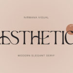
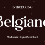
Typography and Calligraphy are two forms of visual arts that are very similar in that they require the arrangement and display of letters. From this perspective, one can be easily confused with the other since both of them’re about bending forms to convey concepts graphically. But these two disciplines have different conceptions of the art of letters at their base. While in typography, there is an emphasis made on accuracy, repetitiveness, and type margins and arrangements, calligraphy is a form of writing that is characterized by free flowing movement, spontaneity, and individuality.
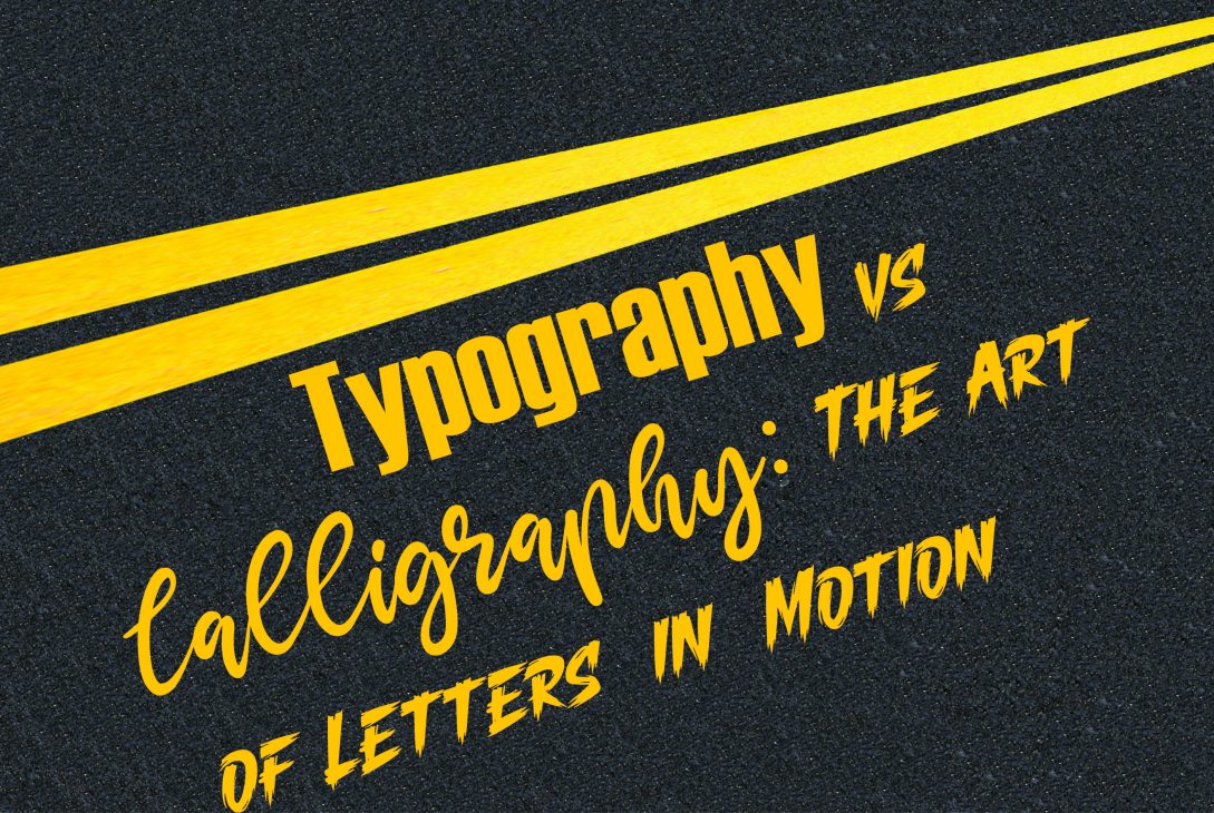
In this exploration of “Typography vs. Calligraphy, in the episode “The Art of Letters in Motion,” we will explore what makes them different, the history behind each one, and how it influences the design sphere.
Understanding Typography: The Art of Structure
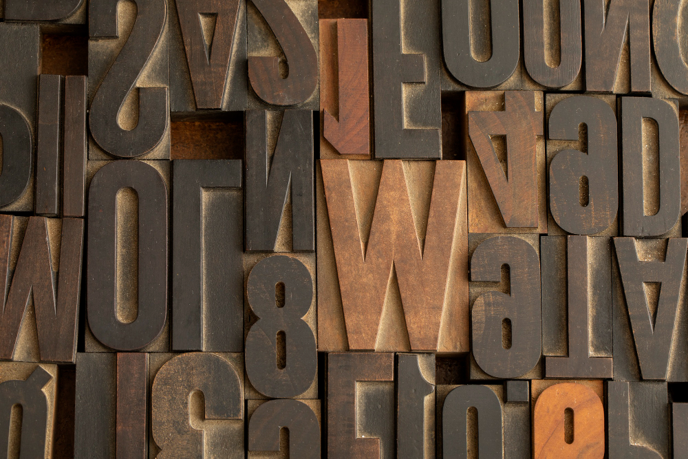
Typographic design is the discipline and craft concerned with arranging type in order to create readable, aesthetically pleasing eyesight of printed text. It is used in print as well as electronic media; the major point of the typography is generally utilitarian—the conveyance of information in a legible form.
Origins and Evolution of Typography
Typography is related to the establishment history of the movable type printing press that appeared in the 15th century by Johannes Gutenberg. This was the revolution that enabled mass production of the text, which helped to make the letters homogenous and therefore make different printed documents similar. After that, typography was associated with the technological development, offering an array of fonts and typefaces for specific usage and electronic platforms.
Typography, if one looks at it the right way, is all about control. Typeface choices are chosen, margins and line heights are set, and specific shapes of letters are adjusted for not only good looks but readability too.
Key Elements of Typography
Typography is often associated with fonts, but it encompasses much more than that. It includes the following key elements:
- Typeface: The typeface or font of the letters being used in a piece of work, like Arial, Times New Roman, or Helvetica, etc.
- Font: The fonts refer to a specific typeface and of a certain type size, whether it is Arial Bold 12pt.
- Kerning: The space between the two characters, of the two characters, and within the individual characters themselves.
- Leading: The space in between a row of parallel lines of text.
- Alignment: How the text is arranged in the designs can be centered, justified, or aligned to the left or right.
All these aspects collectively contribute to the formation of an organized structure of letters. Letters in typography are quite stable—they are bound within certain locations where they are set with the purpose of having a systematic appearance within a certain design. In this regard, typography may be described as the art of actively moving letters within a certain framework while at the same time making them harmoniously cooperate.
Understanding Calligraphy: The Art of Flow
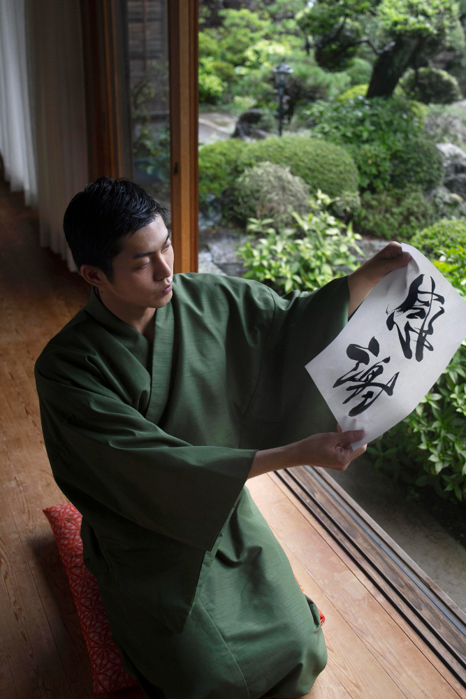
Calligraphy, on the other hand, is still a more flexible art form, or, to be more precise, it is a virtually single type of written text that is done in an artistic manner, using a brush or some other tool as a writing instrument and capable of using more elaborate forms of letters. While in type design letters are the elements of a system that is to be functional, in calligraphy they are viewed as single autonomic works that are full of life and character.
Origins and Evolution of Calligraphy
Art of writing provokes history for thousands of years, and several cultures were engaged in the creation of calligraphy. From the writings of historical China to Arabic to the scripts of medieval Europe, calligraphy has been part of culture and art in every region of the world.
Letters in calligraphy are not just symbols, means of communication, and signs—they are living ones, or rather, each letter is a type of movement of the hand as it holds the pen. The movement made in writing each letter is part of the art, and this is why calligraphy is much closer to the craft of letter design.
Key Elements of Calligraphy
Calligraphy, while seemingly free-flowing, also follows certain principles:
- Stroke Order: Letters drawn in an order that dictates the flow and direction of the script—the order in which strokes are made when writing each letter.
- Pressure Sensitivity: The difference in the pressure that is used while drawing operations such as pen strokes or brush strokes further enhances the expressiveness of the letters.
- Rhythm: The coordination that creates that sense of rhythm and flow, the harmony or lack of it in the prose.
- Balance: The balance inside and outside of the letter, which as a rule is maintained by placing the strokes and using the absence of an area.
Calligraphy, on the other hand, has a spontaneous nature, and it is all the more so given that letters are drawn anew each time. Instead of writing the same letter over and over, a calligrapher will modify something so that the letter is a new creation every time. This organic nature of calligraphy makes it look as though it has dynamism since one stroke can be made in a different way than the previous or next one, as opposed to typography, which has to be consistent.
Typography vs. Calligraphy: The Balance of Structure and Flow

Typography and calligraphy are just two extremes in letter design between which there can be hundreds of classifications. Typography has historical ties with structures, precision, and replication, while calligraphy is linked with the fluidity and uniqueness of handwritten letters. They are both unique in their application and are most often employed because of the specific result that they can elicit.
Typography: Structured Letters in Motion
In typography, meaning ‘the motion’ refers to the position of letters within the given design. Space, together with alignment and regularity, introduces a melody that leads the reader’s eye through the text. Through a well-designed typographic composition, a reader can achieve a certain balance and rhythm, which helps while reading despite the fact that letters themselves do not’move’.
Typography’s motion concerns direct the reader’s attention as to where they should go next; this is done through the use of hints such as kerning, leading, and the text hierarchy. The objective that has been set in order to prevent the work from looking too mechanical is to try to orchestrate the letters in such a manner that although they are set on a perfectly geometric grid, they seem to be on some kind of choreographed performance.
Calligraphy: Letters in Physical Motion
In calligraphy, however, the motion is much more precise, or maybe one can say more violent, in its execution. The letters themselves are drawn or rather written with the hand, so each letter is a document of movement. Whereas in traditional art, calligraphy has less to do with precision than it has to do with the intention of the artist. That is why calligraphy is so interesting; in each letter there are some natural differences.
Calligraphic letters are in constant motion not only from letters’ production but also from letters’ state on paper. The thick and thin lines, the open semicircles, and the engraved small forms are all given in harmony as if all the letters were in motion.
The Intersection of Typography and Calligraphy
Typography and calligraphy are two separate forms, though there are occasions when the two are used together. However, as for many of the contemporary designers, they try to blend the two—the constructive typographic convention and the calligraphic one. This can be observed in hand-lettered typefaces in which the letters are handwritten but are later transformed into an actual usable font. These combinations make it possible to come up with the best of the two worlds—the typographic approach together with the calligraphic designs.
Conclusion: Choosing Between Two Forms of Art

Typography and calligraphy are two completely different things, as each of them brings value to the world of design. Typography shapes up the forms and establishes order and standardization that makes it useful for utilitarian purposes in both print media as well as electronic media. Being handwritten, calligraphy has that extra flair that is ideal for invitations, logos, and other special functions.
The last point is that the decision of whether to use typography or calligraphy depends on the assigned task. But if you require clear, concise, and standardized text, then you can rely on typography. However, in cases where you want to create something artistic and full of emotions and driven by motion, calligraphy will come in handy in enhancing the value and meaning of the design.
Both of them revive letters, making them not only symbols—they become something artistic, each having its own movement and plot.


