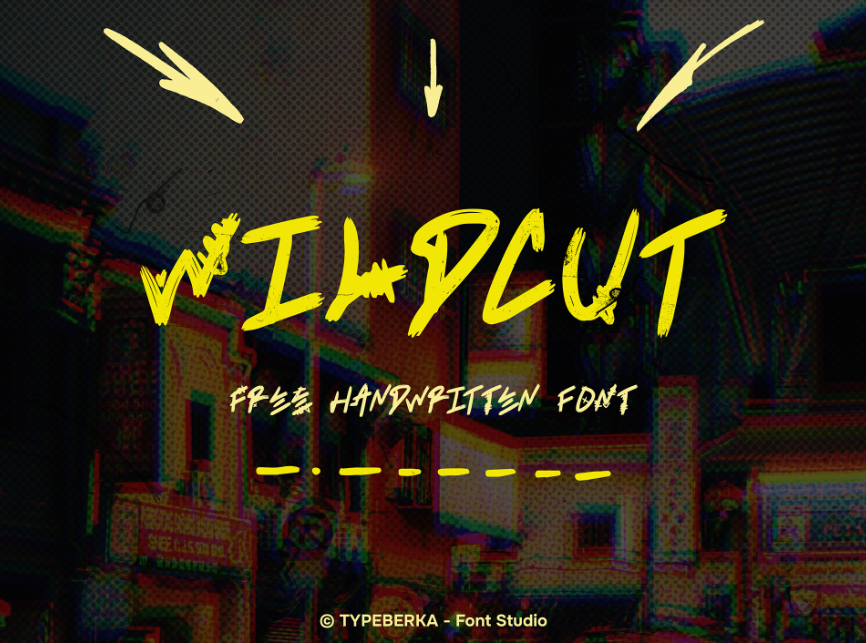
In the world of fonts, making designs feel warm and real is tough. WILDCUT by TYPEBERKA Font Studio is one such handwritten font that stands out. In this article, we’ll explore what makes WILDCUT unique, how it was created, and how designers can use it in different projects.
WILDCUT is a carefully crafted handwritten font that has a imperfect look. It mimics real handwriting with uneven strokes and variating line thicknesses, making it feel aggressive and expressive. The font has a friendly vibe, making it a great for projects that need to feel personal and full of energy.
TYPEBERKA Font Studio, the creators of WILDCUT, are known for their focus on hand-drawn and script-based fonts. They aim to create fonts that are not only useful but also full of personality. WILDCUT fits perfectly into this idea, as it looks like it’s full of life on the screen or page.
Character Set of WILDCUT
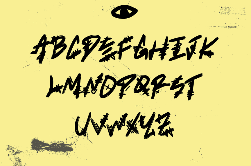
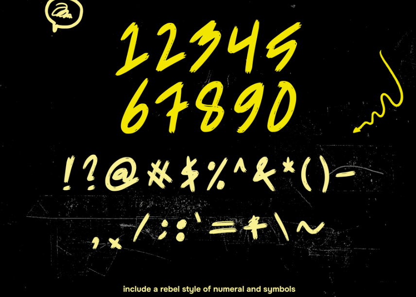
Inspiration Behind WILDCUT
Many handwritten fonts are inspired by the designer’s own handwriting, and WILDCUT seems to be no different. Its strokes feel spontaneous, like they were drawn with a marker or brush pen. Unlike fonts that strive for perfect lines and shapes, WILDCUT embraces the natural quirks of handwriting. These variations in pressure, angle, and speed make the font feel more human and unique.
The name “WILDCUT” suggests that this font is untamed and different from the usual clean and neat fonts. This makes it especially appealing for creative projects that need to stand out and feel original.
Use of WILDCUT
One of the best things about WILDCUT all-round. While it has a distinctive handwritten style, it can be used in many different design situations. Whether you’re working on branding, social media graphics, packaging, or invitations, WILDCUT’s informal look can add a natural touch of handwritng. Its playful and relaxed feel works well for projects that need a casual, friendly tone.
For example, WILDCUT could be a great font choice for a children’s book, adding fun element. It could also be perfect for advertising a fast food shop or boutique that wants to create a warm, welcoming atmosphere. Additionally, this font can be used in quotes or social media posts to give a more human and relatable feel.
Even though WILDCUT has a free-flowing style, it’s still easy to read, which is important for keeping the text clear while making it visually interesting. This balance between being expressive and readable makes WILDCUT a valuable tool for any designer.
Creation of WILDCUT
Creating a handwritten font like WILDCUT takes both creativity and technical skill. Designers at TYPEBERKA Font Studio likely started by sketching the letters by hand, trying out different tools and styles to get the right look. This early stage is key because it sets the overall tone for the font.
One of the challenges in designing handwritten fonts is ensuring that they are fit for different sizes and in different situations. The font needs to keep its unique style while still being practical. It seems that TYPEBERKA Font Studio has successfully struck this balance with WILDCUT.
WILDCUT is a special handwritten font that combines spontaneity with versatility. Its natural, imperfect charm makes it a great choice for projects that need a touch of authenticity and personality. Whether it’s being used for branding, social media, or print design, WILDCUT by TYPEBERKA Font Studio offers a creative and expressive option for designers wanting to add a personal feel to their work.
License
Free for personal and commercial use.


