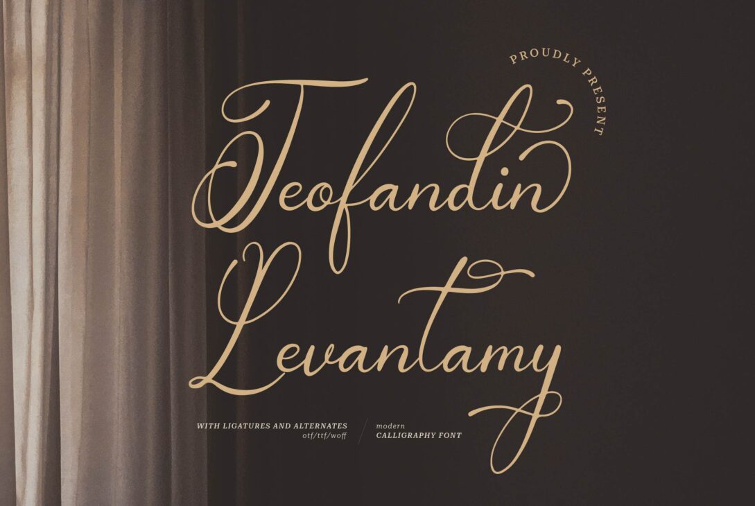
Give your designs a touch of whimsical charm with Teofandin Levantamy! This gorgeous script font, crafted by Dede Nugraha of Denustudios, boasts graceful flourishes that dance across the page. It’s a perfect fit for crafting unforgettable wedding invitations (free for personal use!), but for branding projects, a commercial license is necessary. Check out Denustudios or other reputable sources to unlock its full potential!
Teofandin Levantamy A Script Font Character Set
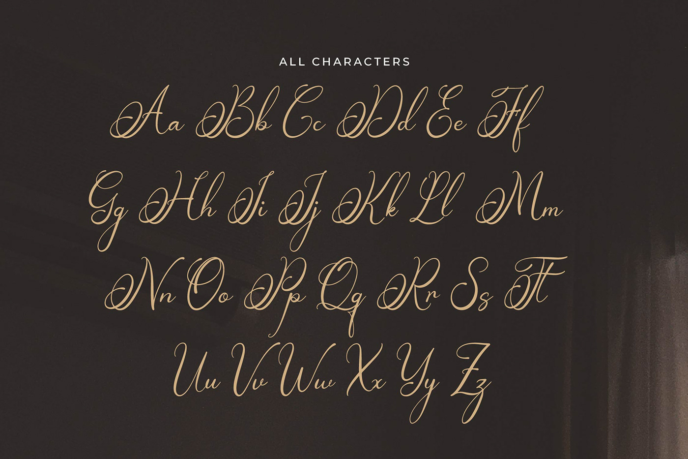
Teofandin Levantamy likely sticks to the basics for characters. It’ll have the usual letters (A-Z, a-z) you need for writing in English. More exotic characters from other languages are probably missing.
Numbers And Punctuation
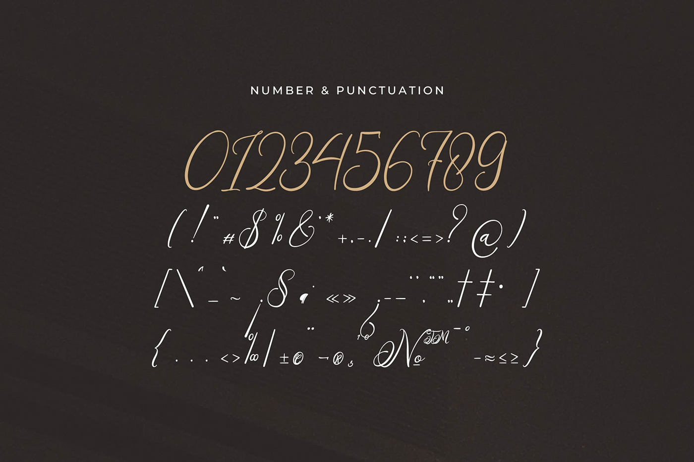
Teofandin Levantamy likely includes basic numbers (0-9) and common punctuation along with its letters.
This means you can expect to find punctuation marks like:
- Periods (.)
- Commas (,)
- Question marks (?)
- Exclamation points (!)
However, it’s important to note that this is an educated guess.
License
Free for personal use only.
Why Script Fonts Are Important?
Script fonts aren’t just fancy letters for invitations. They’re a design powerhouse, adding personality and oomph to your projects. Here’s why they matter:
1. Elegance on Demand: Imagine a wedding invitation written in a flowing script. It instantly feels classier, right? These fonts bring that same touch of elegance to logos, branding, and even packaging.
2. Feeling the Mood: Script fonts can actually change the vibe of your message. Formal scripts, with their neat lines, feel traditional and important. Think certificates or legal documents. On the other hand, playful scripts with uneven letters feel more casual and friendly, like a restaurant menu inviting you to relax and have fun.
3. Shine Bright, Not Everywhere: These fonts are like spotlights. They grab attention in headlines, titles, and logos. But for long paragraphs, they can be hard to read. Use them strategically where you want people to look first.
4. The Personal Touch: Script fonts feel more human than standard fonts. They add a personal touch, making your message feel more heartfelt. Think of a handwritten thank-you note. It feels more sincere than a typed one, right? Script fonts can create that same warmth in your designs.
Remember: These fonts are powerful, but use them wisely. Keep them big and clear for headlines, and choose standard fonts for large blocks of text.
So, next time you want your design to stand out, consider the magic of these fonts. A touch of graceful style can make a big difference.